A couple of days ago, there was a question posted on etsy forum about how to capture the colors of theme objects accurately on photo. There were suggestions of types of light source (natural light works best), brand of cameras (quality isn't really proportional to price), camera settings, computer monitor settings... That set me off thinking about my experience with seaglass photography. I believe the choice of background colors is very important too.


Diffuse sunlight gives us the most balanced color spectrum to work with. But I just love the way the setting sun lights up my seaglass!

Our eyes work differently from a camera - a piece of seaglass on a white background may look the same to us in natural or artificial light, but not so for the camera.
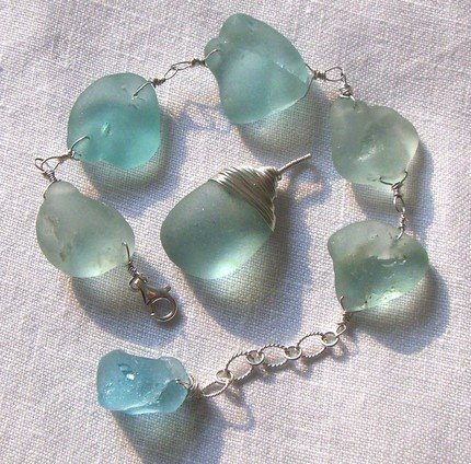
For example, I find it very difficult to capture the blue-green colors of teal and turquoise seaglass if I used a white background. This is because of the subtle fluorescence in bleached white paper or fabric. The camera picks this up as a diffuse blue tone, resulting in the turquoise / teal being comparatively greener than they really are.
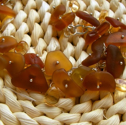
I've overcome this by using a beige background or one with a yellow undertone, or white material that has no fluorescence - eg. ceramic. 


These are the same batch of turquoise seaglass, taken under the same lighting condition (diffuse sunlight) with the same camera and same camera settings. The only difference is the background: white paper and beige paper for the first and second photo respectively.
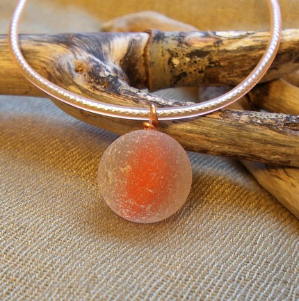
White is another problem I had. The exposure is never quite right when shooting white seaglass on a white background. White on black background is sometimes too contrasty either. Then I've found that a pale shade of grey or goldtone works wonders!
I still do not have a working principle for matching background colors with subject colors, but the there's always nice surprises in the process of finding out!

Diffuse sunlight gives us the most balanced color spectrum to work with. But I just love the way the setting sun lights up my seaglass!


